STORE UX &
UI DESIGN
DIGITAL - 2019
ROLE
UX/UI Designer
DURATION
2 months
TOOLS
Adobe XD, Photoshop & Illustrator
MEDIA
Wireframes & hi-fidelity web & mobile UI mockups
THE OVERVIEW
WHAT IS MAYNOOTh?
Maynooth is a furniture store run by the Tierney family and based in the east of Ireland with stores in dotted around Munster, Leinster and Connacht. The store has recently gained in popularity due to a snappy, voguish Instagram presence and collective love from many of the locals after many years warm and helpful service.
THE PROBLEM
IT’s KINDA HARD TO SELL FURNITURE THE TRADITIONAL WAY
For such a store, it can be difficult getting customers outside of the local area without a robust social media presence. Buyers don’t come to Maynooth just to browse and leave, most are there because they were passing through or live close to the store or because they badly wanted to buy an item they saw on Instagram. To progress to the next stage of their business, the Tierney family need to invest in an online store that replicates the in-store service they provide while also battling the competition of behemoths dominating the market like Ikea, Argos or DFS.
THE SOLUTION
USE THE SOCIAL MEDIA VISUAL AESTHETIC TO OUR ADVANTAGE
I was to identify opportunities and utilize my knowledge in designing a solution to an e-commerce service where users can browse and buy furniture items, but also to design an experience where users can get a feel for room styles, come to be inspired by colors and item arrangements and bring that sense of exploration one gets walking into a furniture store into the online world in a voguish and modern new way.
DISCOVER PHASE
USER INTERVIEWS
FINDING THE ISSUES IN FURNITURE SHOPPING
For an online service like this, where the target audience is mainly homeowners or parents with busy schedules, I decided that 1-on-1 interviews were essential in order to empathize with their situations and discover the issues people face when buying furniture online. I really wanted to delve into the narratives of our users to identify opportunities and reduce gaps in sustainable online furniture shopping. Out of 5 semi-structured interviews, I was able identify the core struggles and stressors that people faced.
1.
“Shopping for furniture is.. maybe a little boring and.. I find it stressful. I have to prepare myself to go online and search for something, it’s a chore.”
EFFORT ISSUES
People don’t want to be bored or stressed looking for furniture online. It should and can be a recreational experience, something as fun and interesting as browsing your Instagram or Pinterest feed.
2.
“I am not an imaginative person, sometimes I will see something I really like online but I’ll have to wait for it to be delivered to know if it will definitely suit the room.
CREATIVE ISSUES
Not everyone has the ability to create rooms in their head and imagine how objects visually interact with each other. A place that tickles the imagination and provides inspiration could be all that’s necessary to fill that creative gap.
3.
“I hate buying online, the websites never work the way you want them to. Nothing beats the atmosphere of going into a real store with staff taking care of you.”
INTERFACE ISSUES
While nothing can ever beat the experience of walking through an Ikea maze, online shopping doesn’t need to be clunky or frustrating. It can be an experience just as exploratory and exciting as the real deal.
COMPETITIVE ANALYSIS
WHAT DOES THE COMPETITION LOOK LIKE?
I wanted to get an understanding of what the competition was in both the furniture commerce sector and social media. The aim was to get an insight into the solutions provided by other brands, stores and services in terms of features and to see what would and wouldn't work for Maynooth. I decided to go for:
Ikea: A famous furniture retailer known for their easy to use website and a unique in-store experience.
Habitat: A lesser known furniture retailer with a trendy, well designed online store.
Pinterest: An image focused social media platform utilized by many for style inspiration and mood-board creation.
❌ UI encourages explorative behavior and recreational browsing
❌ Aids creativity and decor style development
✅ Clean UI that’s easy on the eyes and easier to navigate
✅ Searching for particular products is often easy and requires little time
❌ UI encourages explorative behavior and recreational browsing
✅ Aids creativity and decor style development
❌ Clean UI that’s easy on the eyes and easier to navigate
✅ Searching for particular products is often easy and requires little time
✅ UI encourages explorative behavior and recreational browsing
✅ Aids creativity and decor style development
✅ Clean UI that’s easy on the eyes and easier to navigate
❌ Searching for particular products is often easy and requires little time
DEFINE PHASE
PERSONAS
Who are my users?
The Executive
Katherine is an executive at an international medical device company, she earns $110,000 per year and is both style and price conscious. She has children at university and browses style guides on Pinterest in her spare time.
The Single Parent
Sarah is a single parent living in the suburbs outside the city. She finds it hard to manage her time between work and housekeeping and relies on her parents for a brief oasis outside of motherhood. She is an avid Instagram user and tends to follow a lot of style and fashion pages.
The College Student
Leah is doing her masters and is in the second year of her program. She has moved into a small apartment just outside the university campus and has gotten into plant keeping and decorating in her spare time. She frequents the internet to get ideas on how to stylize her apartment.
JOURNEY MAP
BUYING FURNITURE ONLINE CAN BE PROBLEMATIC
Shopping for anything online comes with some risks, sometimes what arrives isn’t quite what you imagined you’d be getting at the checkout. Plug this in with clunky interfaces and choice paralysis and you have yourself an online experience that causes more stress than it physical counterpart. The journey map for Katherine further supported the existence of these main problems and got a discussion going on possible opportunities and solutions that lay ahead of us in the design process.
IDEATE PHASE
BRAINSTORMING
HOW MIGHT WE?
I decided to use the 'How Might We' method to try to come up with a variety of different solutions to the problem and to turn insights from the 'Discover Phase' and the 'Define Phase' into opportunities for my own design. At the start of the project, I had three main questions in mind:
1.
How might we take inspiration from the layout and interface design of social media feeds?
Take on the look and feel of social media UI designs like Pinterest and Instagram.
Design a space for users to explore through curiosity rather than necessity.
Lure users into exploring the full depths of your shop with interesting content.
2.
How might we provide users with a visually aesthetic and pleasing experience?
Users have fun exploring a feed of beautiful items for sale.
Quality visual aesthetics ignite the imagination and allow one to wonder about these objects in their own home.
Users may find themselves browsing for reasons other than instantly buying, just to check out what’s new.
Users can bookmark style ideas and inspiration for later use.
3.
How might we make shopping for furniture as easy as possible, stupidly easy?
Users spend less time figuring out how to navigate and more time browsing thousands of interesting items.
Much less stressful for those who don’t really like technology or online services.
AFFINITY MAP
thirty-five sticky notes
I needed to lay out all the data and brainstorming ideas I had gathered, and get a better understanding of the potential users and how I could design a relevant and useful service for them. I organized the findings into groups in an Affinity Map. Using this map I could identify common habits, function options and opportunities.
FEATURE MATRIX
SEPARATING THE GOOD FROM THE UGLY
Jksabjx
USER FLOW
NAVIGATING OUR WAY THROUGH MAYNOOTH
To get a clear and concise picture of all the possible routes a user could take, I mapped out an entire user flow chart. This way I could identify any missing connections, features or opportunities.
DESIGN PHASE
PAPER PROTOTYPING
GETTING THOSE IDEAS DOWN
I started my ideation and design phase by sketching out different potential designs on what the interface might look like. I found this particularly helpful in a solo project like this as it helped me see clearly what would and what wouldn't work. It was also a really good way to brainstorm different ideas and spot alternative opportunities.
WIREFRAMES
GOING DIGITAL (AFTER MAKING SOME CHANGES)
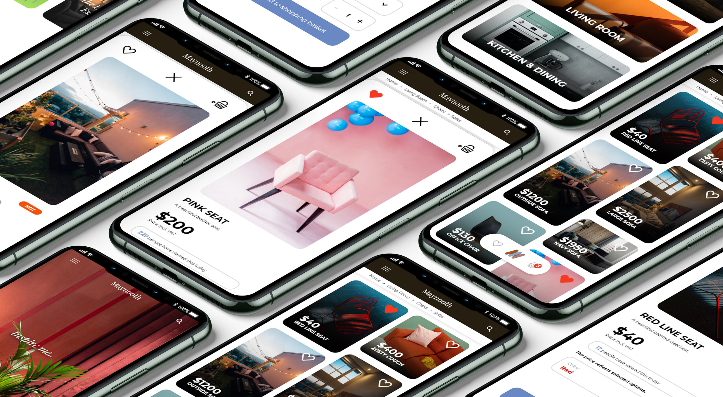
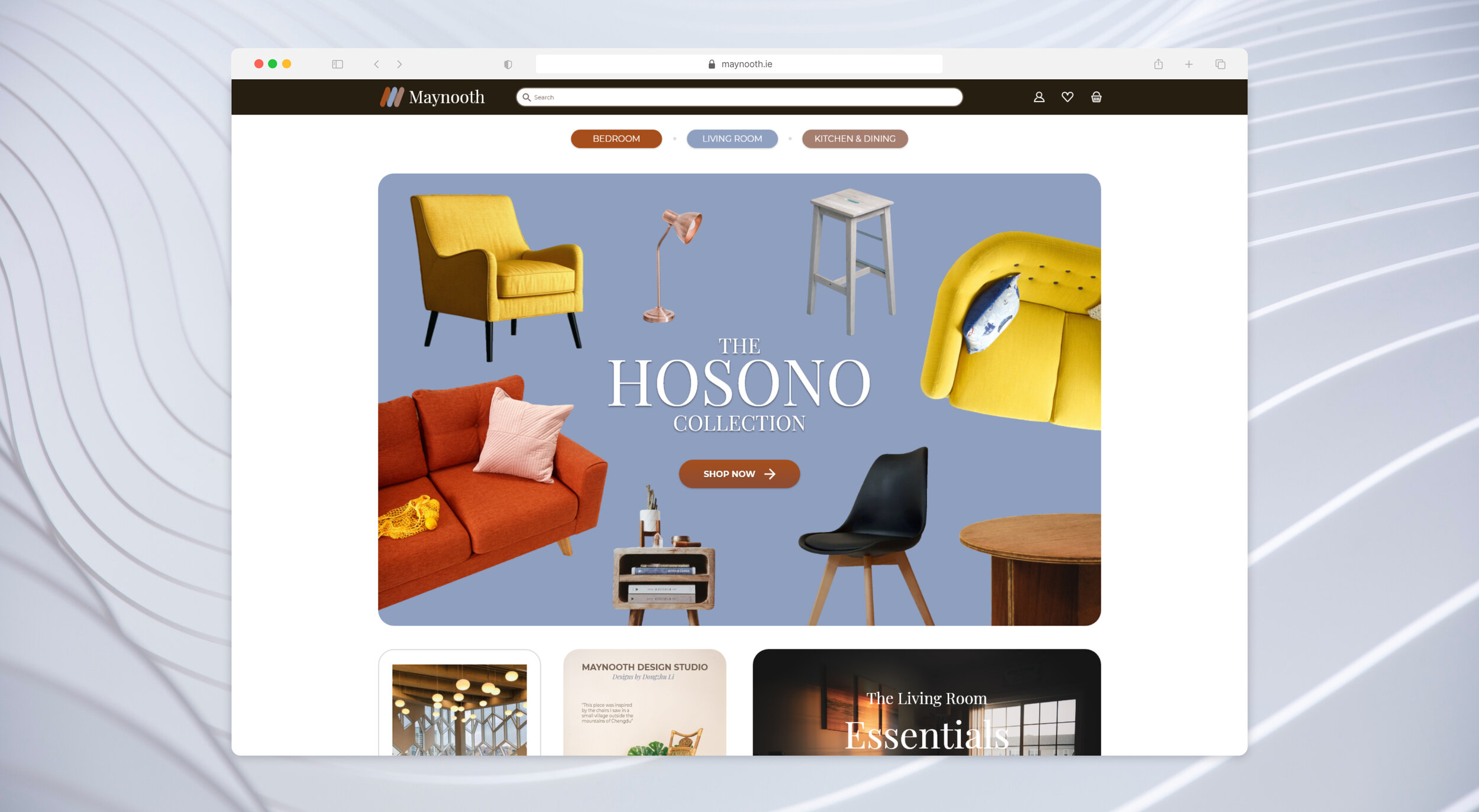
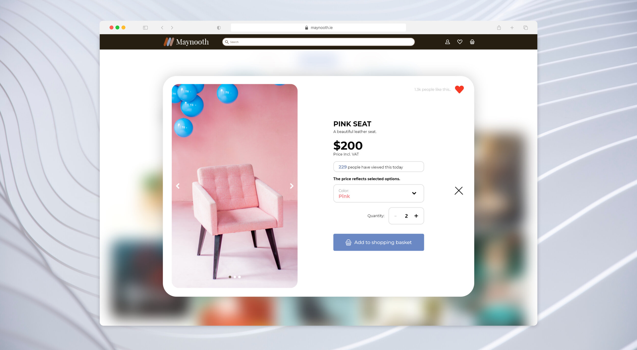
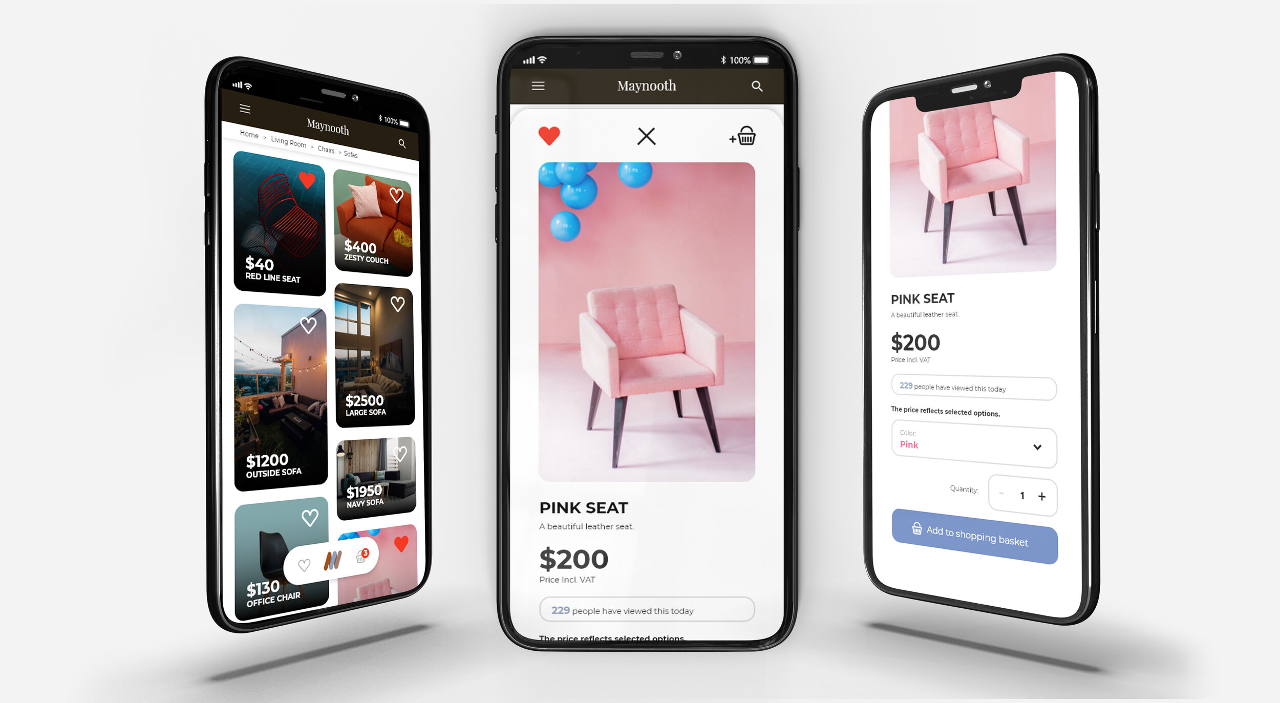
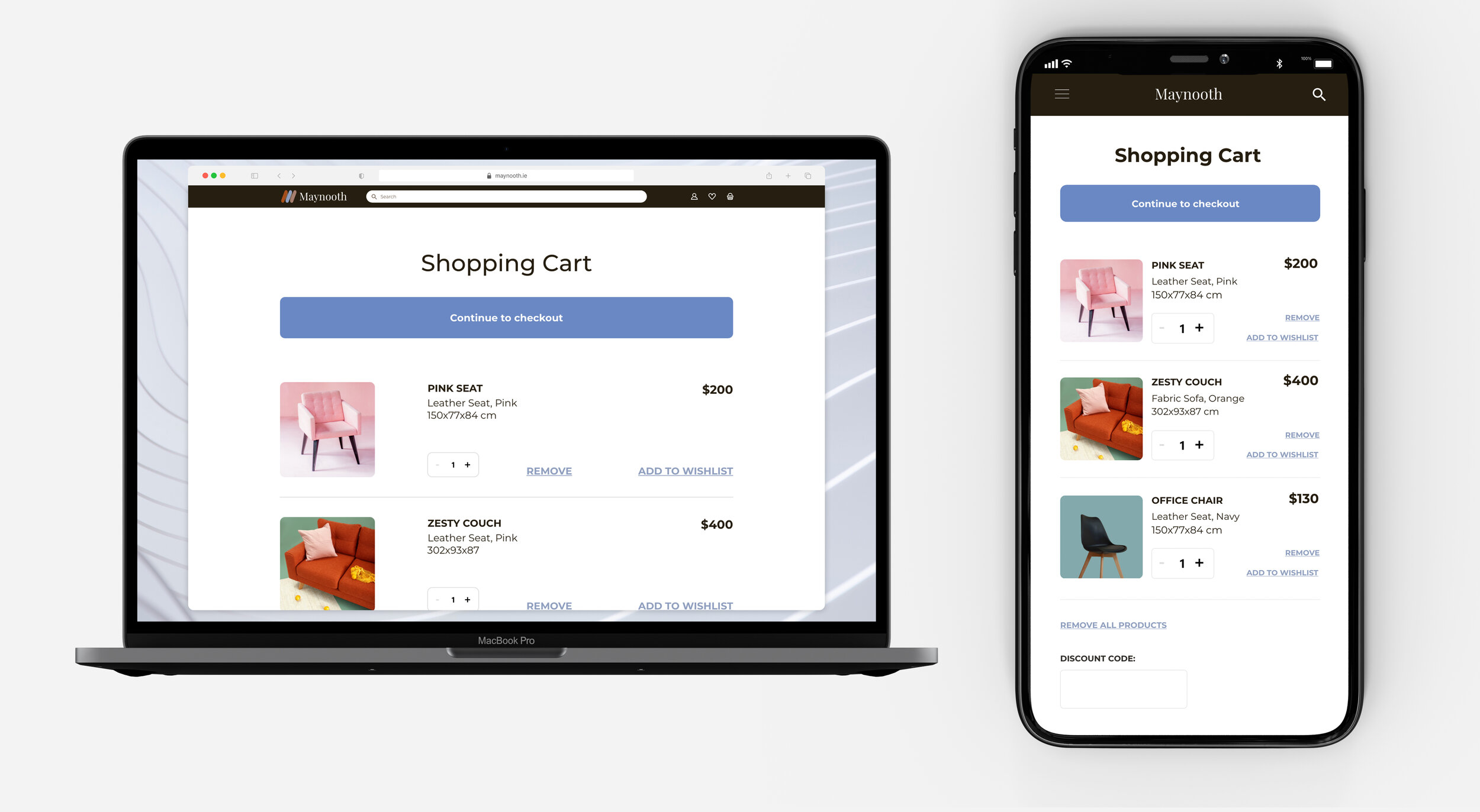
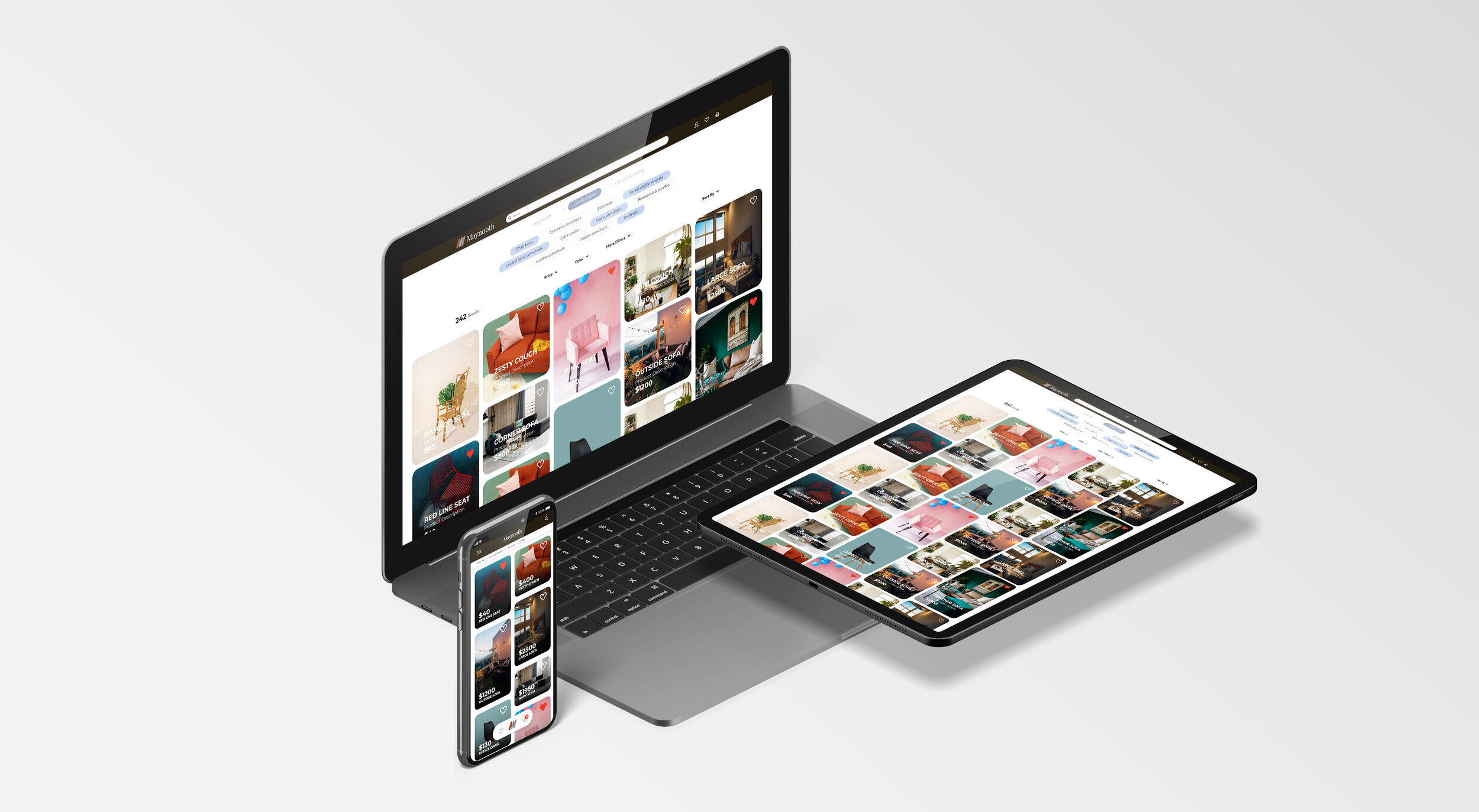
After several rounds of testing, I iterated and improved the design based on user feedback and using Adobe XD, designed a high-fidelity wireframe for further testing.
A/B TESTS OF WIREFRAMES
LET THE PEOPLE CHOOSE
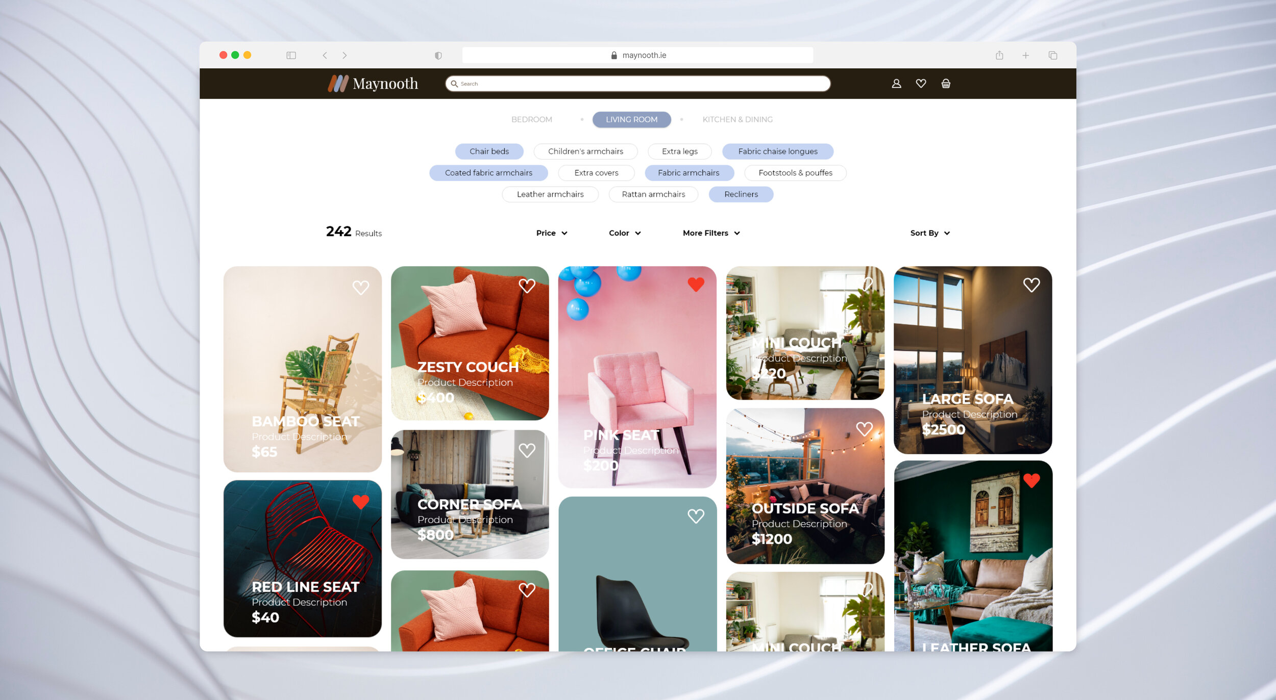
I created alternate wireframes of the “product details” and ‘product list’ pages and ran A/B tests. The A/B tests helped me figure out what users preferred in terms of the ease of digesting the content, entering data, and visual appeal.
A
❌ LOSER
B
✅ WINNER
A
✅ WINNER
B
❌ LOSER
STYLE GUIDE
INJECTING SOME STYLE INTO THIS
The process of creating the branding style around Maynooth changed on one or more occasions. The original style of Maynooth’s brand was very similar to the one used in the first digital wireframe designs. After gathering feedback and applying my own design suggestions, I decided to use a cleaner style with a revised color palette. I wanted the Maynooth experience to be clean, calm and minimalist with a dash of personality inspired by modern day furniture design trends.


